|
O·M·N·I User's
Manual #4
Creating Objects &
Windows for Your FOR
CONTENTS
4.2 Window Elements & Their Properties
 4.1 The O·M·N·I Window Editor Your O·M·N·I Online Information System features complete object-oriented communications, which means that you can choose which objects are sent live and which ones will be automatically stored on your caller's computer (objects are the basic building blocks of the windows you create and display on your system). By storing commonly used information on the user's end in the form of "permanent windows" [see Section 4.3.3 below], your system will remain much more responsive to all callers. For example, if you make changes to a permanent window that was previously sent and stored on their computer, only the changes to that window will be sent—i.e., the modified objects only—not the entire window. This way, your callers will also have things updated more quickly . . . than if everything had to be sent each time they logged on to your system. You can also create permanent forums on your system, where the windows and objects for a forum, or area, on the system are sent permanently to the user's computer only when they enter the forum for the first time [see Section 4.1.2.2 below]. All the objects and windows used on your system must first be created using the O·M·N·I Window Editor—which is by far one of O·M·N·I's most unique and powerful features. The Editor gives you all the tools you need to actually custom-design what users will see on their screens whenever they connect to your system. It's what also gives you the ability to create the "look and feel" of a commercial online service—like America Online® or CompuServe®! Editor installation is achieved during normal
installation of your O·M·N·I Online Information System
software. When the "O·M·N·I Window Editor" comes up on your screen you'll see a toolbar (the Element Palette) and two windows (the Window Browser and the Object Browser) on your desktop. You may click-and-drag these to any position; the Browser windows are also sizable. For practical purposes, position the toolbar on the left and the two Browser windows on the right to leave your work area open in the middle of your screen. Following are a few things you should know before you start using the Window Editor [also see your Window Editor tutorial—file 4TUTORAL.WRI in your \DOCS subdirectory—for a helpful hands-on approach to learning how to use the Editor]:
You'll find that you'll have more space to work with in the Editor if you use a screen resolution higher than 640x480, but you should keep in mind that this will also scale down the sizes of the actual windows you create. Due to the conventional limitations of many user terminals, it is best to size your windows as though they will be viewed at this lower resolution. The color standard in O·M·N·I, however, is 256-color. At this level, you may create and use high-quality graphic images while still maintaining optimum transfer speeds.
The windows and objects you create (or edit) in the Window Editor are stored, by default, under the \EDITOR\WINDOWS subdirectory. However, the windows and objects utilized by the O·M·N·I Server are stored under the \SERVER\WINDOWS subdirectory. Before your Server can use any new and/or updated windows and objects, you must first copy them from your \EDITOR\WINDOWS subdirectory directly to your \SERVER\WINDOWS subdirectory. (Similarly, whenever you specify or make changes to any "Permanent Windows" and/or the "Startup Window" on your system [see Section 4.3.3 below], you must copy the files PERMWINS.DAT and STARTUP.DAT, respectively, from your \EDITOR\SYSTEM subdirectory to your \SERVER\SYSTEM subdirectory before any changes will take effect.) By maintaining separate copies of all your windows and objects in this way, you may continue to edit new or existing windows and objects completely offline . . . without interrupting your O·M·N·I Server. This way, your callers will still be able to connect to your online service even while you're making changes to it! You may easily copy your windows and objects (and ANSI text screens) directly from the O·M·N·I Server by selecting Move Windows & Menus from the Server menu and launching the O·M·N·I Window Mover utility. [For complete instructions, please refer to Section 3.1.3 in your O·M·N·I Server documentation.]
To test how the windows and objects you create in the Window Editor actually work online, your system's installation of O·M·N·I Term supports a local login feature which allows you to actually "log on" to your O·M·N·I Server as if you were a remote user—without using your modem or phone line. Local login uses the same protocol that direct (phone) dial-up or connecting from the Internet uses to communicate. This means that all functions available via dial-up are also available via the local login (e-mail, chat, upload, download, etc.). Not only will you be able to see how your windows and objects will appear online, but you'll also have an opportunity to test their actual function. To set up Local Login, open O·M·N·I Term and proceed as though making any new entry into your Dialing Directory: Select either the "Dialing Directory" button or the Dialing Directory menu item (under Show on the File menu) on the O·M·N·I Term tool bar to open the "O·M·N·I Dialing Directory" window—then press the Add button. Enter a name under System Name then select "O·M·N·I • Local Login" as the Connection Type. (Also enter information into the User ID and Password fields, since you will actually be recognized by your own system as a "new user" when you log on locally for the first time!) When finished, click Done. Next, open the "O·M·N·I Server Node Setup" dialog box by clicking on its icon in your O·M·N·I program group. Specify a node you wish to use for local login connections, then under the Comm tab simply check Local Login and click Done. You may now launch your Server as usual. Your local login node should be listed—along with any other nodes you are running—and "Waiting for local connection..." Now open O·M·N·I Term and select your local login entry from the Dialing Directory or "Sign On" window. Sign on as you would for any dial-up system. You will now be able to see and experience exactly what others do when they sign on to your system remotely. NOTE: Before you attempt to test your system using local login, make sure that you have moved all appropriate objects and windows from the Window Editor to your O·M·N·I Server [see previous section above]. 4.1.1 The Window Browser The Window Browser [Figure 4-A below] offers a
convenient internal method of organizing and
managing every window you create. You may find the
window browser useful for categorizing, naming, and
keeping track of windows which are both in the process
of being created and which have already been utilized
online. 4.1.1.1 Creating Window Groups Before you may create any window, you must first create a window group, under which the actual windows you create may be named and listed. NOTE: The names used in both the Window Browser and Object Browser are used internally by your system in order to provide you with a descriptive reference name for organizational purposes. You will create the actual titles (or, rather, "caption text") for your windows and objects elsewhere in the Editor. This design option will be covered later.
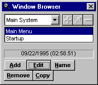 Figure 4-A In Figure 4-A above, note the plus (+), the
angled arrow, and the minus (-) buttons to the
right of the Window Group drop-down field. Pressing any
of these displays a dialog box for adding, renaming, or
deleting a Window Group, respectively. Compare these to
the Add, 4.1.1.2 Adding Windows To create a window, you must first have at least one Window Group to work with [see Section 4.1.1.1—"Creating a Window Group" above]. You can create a total of 255 windows for any one Window Group. To add a new window, select the Add button and enter a descriptive name (up to 50 characters in length) in the "Add Window" dialog box. NOTE: The windows you create and edit are not entirely functional inside the Window Editor; they are, essentially, non-working "models" of the actual windows your users will see when online. When you have completed a window within the Editor, you will export it to your Server, where it may then be utilized by your callers [see Section 3.1.3 of your O·M·N·I Server manual for complete instructions]. 4.1.1.3 Renaming Windows To rename an existing window, select the Name
button and enter the new name in the "Edit Window Name"
dialog box. The descriptive name you enter may be up to
50 characters in length. 4.1.1.4 Editing Existing & New Windows To edit the currently selected window, choose the Edit button (or just double-click on it) and the desired window will pop up for you to begin making changes. If no previous editing has been performed yet on a window you've added to the Window Browser, a blank window will appear in your "work space" for you to begin editing . . . and this is how you start creating new windows! NOTE: You may open and edit several windows at a time in the Window Editor. 4.1.2 The Object Browser The Object Browser [Figure 4-B below] offers an extremely useful and convenient tool for organizing and managing all the objects you use for creating the windows on your system. Since objects may be referenced as many times—or in as many windows—as you want, careful planning should go into the way that you categorize and name them in the Object Browser. 4.1.2.1 Before you can create any object, you must first create an object group, under which all the objects you create will be named and listed.
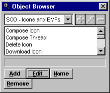 Figure 4-B In figure 4-B above, note the plus (+), the
angled arrow, and the minus (-) buttons to the
right of the Object Group drop-down field. Pressing any
of these displays a dialog box for adding, renaming, or
deleting an Object Group, respectively. Compare these to
the Add, 4.1.2.2 Objects are created and organized within Object Groups. You cannot create a new object unless you have at least one Object Group. To create an object, select the Add button then type a descriptive name (up to 50 characters in length) in the "Add Object" dialog box. You can create as many as 255 objects in any individual Object Group. Choose the type of object you wish to add from the Type drop-down field and select Ok. The newly added object will instantly appear in your listing inside the Object Browser. Following is a complete list of all the types of objects supported by O·M·N·I . . . just as they are listed in the Type drop-down field of the "Add Object" dialog box. NOTE: In each of the following descriptions it is assumed that you have already added the specific object—as outlined above—and that it is present within the Object Browser. Also, in each case, a preview of your selected file is available for review before you actually add it to your object listing; but you must be sure to specify the proper object Type in the "Add Object" dialog when you create and Name the object!
The Data Compressed object type is not used internally within O·M·N·I. It is used together with the O·M·N·I Basic scripting language to send application and support files required to run an external application on the Term computer. It allows you to send any type of file you want. All files are stored in a subdirectory called \EXTERNAL which is contained in the cache directory for each specific system a user calls. You can specify a relative path from the \EXTERNAL subdirectory to where you want your file installed. For example, if you specify "TEST\SAMPLE" as the subdirectory in the object definition and the system number in the user's Term is 2, then the file would end up at C:\OMNITERM\DATA\CACHE\2\TEST\SAMPLE. [See Section 4.2.1.4—"O·M·N·I Basic: Advanced Programming and Scripting Language"—below for additional information.] NOTE: To utilize O·M·N·I Basic, you must have the
O·M·N·I Basic script editor installed.
The Document object allows you to create and edit a complete multi-font, full-color text document to be inserted into a Document View element [see section 4.2.2.9—"Document View"—below] for display to your users. To create the actual document object, highlight the new Object name and press Edit. The "Edit Document Object" window [Figure 4-C below] will appear, where you may proceed to create your document as you want it to appear inside the Document View element of your window.
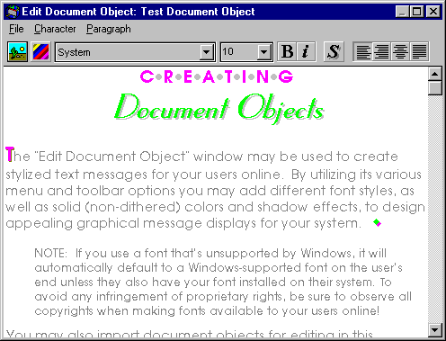 Figure 4-C The "Edit Document Object" window is quite similar to most word processing applications. You can type your text using several different font styles and typefaces, as well as add color and shadowing to your text. The toolbar across the top of the window consists of all the tools that you may use to edit your document object. The first button on the toolbar opens the "Insert Image File" browser and allows you to insert a BMP, GIF, or JPEG image into your document object at the point of the cursor. This dialog may also be accessed by selecting Insert Image File... from the File menu. You may also specify a background color for your document editor by selecting Background Color... from the File menu. [Also see the description for the "Background Color" property under Section 4.2.1.2 below.] The second "colorful" button allows you to select or customize the color of the text you are typing (or text you've already typed and selected to color). The next tool is a drop-down field that allows you to select the desired font, followed by another drop-down field which lets you choose the size of the current font. The next is a toggle button labeled "B" which enables you to set the current font's typeface to bold. The button labeled "i" toggles the italic typeface on and off. The button labeled "S" allows you to give the text a foreground or background shadow, or both, in a variety of different colors. If you prefer, you may also select from the options listed under Character menu at the top of the "Edit Document Object" window to perform any of these functions—in addition to the following properties: Underline Specifies underlined type for the currently selected text and allows you to select from a variety of specific styles, as well as the size and color of the underline.
The last four buttons on the toolbar are used to set the paragraph's alignment to right, left, centered, or justified—respectively. You will also find these options listed under the Paragraph menu . . . which includes another unique property: Border... Opens a dialog which allows you to specify borders of various styles around paragraphs.
You may also select File + Import Document... from the main menu to import documents (in TXT or RTF format) into this window for editing. (Since an imported document will be inserted at the current cursor point, you will be prompted to "clear current document before importing" before the document is actually imported.) Similarly, you may conveniently export the current document by selecting File + Export Document... from the main menu.
The Icon object is simply an imported icon that you may later set to appear in various window elements. After you select Icon from the Type drop-down field and click Ok, the new name will instantly appear in the object listing beneath the currently selected Object Group within the Object Browser. To actually import the desired icon, highlight the newly added icon object name and press Edit. The "Edit Icon Object" dialog will appear, where you may proceed to import the icon by selecting the desired file name—which may include any standard Windows icon (.ICO) file—from the file list field.
When you add an Image object to your Object Browser, you will be able to utilize it in a number of different window elements for display to your callers. Once you name your object and select Ok, the new name will instantly appear in the object listing beneath the currently selected Object Group. To actually import the image, highlight the image's name in the Object Browser and press Edit. The "Edit Image Object" dialog will appear, where you may import the image by choosing the desired image's file name (.BMP, .CMP, .GIF, .JPG or .WMF) from the file list field. The image will instantly appear inside the dialog. NOTE: You may double-click directly on the "current" image to automatically open that object in the O·M·N·I Imager utility!
This allows you to insert a MIDI sound object into a specific window element so that callers will hear it play when they execute a certain command [see Section 4.2.1.3—"Basic Command Properties"—below for a basic application]. To import any MIDI (.MID) file, highlight its newly added object name in your Window Browser and press Edit. The "Edit MIDI Object" dialog will appear, where you may proceed to import the desired file by selecting its file name from the file list field. This object can be used by either the Sound or Alternate Sound tabs of the "Set Command" dialog box or by the "Play MIDI Object" O·M·N·I Basic Script command.
The O-M-N-I Basic Script object allows you to place O·M·N·I Basic script routines into objects, meaning you can actually share a single script between many windows. Use the "Execute Script Object" command in the O·M·N·I Basic script editor to execute an O-M-N-I Basic Script object. [See Section 4.2.1.4—"O·M·N·I Basic: Advanced Programming and Scripting Language"—below for more detailed information about O·M·N·I Basic.] NOTE: To utilize O·M·N·I Basic, you must have the
O·M·N·I Basic script editor installed.
The Permanent Forum List object allows you to set up areas of your system which you may otherwise not wish to include as part of the initial permanent window download (when a user first signs on) . . . but which you might want to send permanently to them once they actually enter the area for the first time. To set up a permanent forum, first create an object group, such as "Permanent Forums," in your Object Browser—then select Add to create a new Permanent Forum List object in the "Add Object" dialog box. Select Edit to open the "Edit Permanent Forum List Object" dialog and add all of the windows you want to use as part of the permanent forum (or area). This works exactly the same way as the "Set Permanent Windows" dialog box. [See item "Permanent Windows" under "System"—Section 4.3.3—for related information.] Next, set the Command property for the element you want to use to execute downloading of the permanent forum when the user selects it: In the "Set Command" dialog box select the "Display Permanent Forum" command from the Action list under the Command tab, and specify the Object Group and new Forum List Object respectively. Then select the Window (from the appropriate Window Group) which will be opened once all the forum's windows and objects have been sent to the user's O·M·N·I Term. NOTE: When specifying a Display Permanent Forum command in O·M·N·I Basic, it is necessary to link the object to a selected window by listing it in the window's Object List property. If you don't your forum will never load! [See Section 4.2.1.4—"O·M·N·I Basic: Advanced Programming and Scripting Language"—below for more detailed information.] Making Changes to a Permanent Forum If you change any of the objects or windows in a permanent forum, you must update the object "version" of the Permanent Forum List object that defines that forum. You can do this at any time by simply opening the "Edit Permanent Forum List Object" dialog for the object and pressing the Ok button. There is no need to make any other changes—just opening and resaving the Permanent Forum List object will update the object's version! Once the object's version has been updated, the Term will recheck the window and object versions for everything used in that forum the next time a user enters that forum. If any of the forum's windows or objects have been updated, only those changed objects and windows will be sent. IMPORTANT: While it is certainly possible to "nest" permanent forums inside each other—that is, place one forum inside another at deeper levels—in order to properly update the object version of any permanent forum located a level or more deep, you must also update the objects for all the previous (parent) levels at the same time in order to maintain "referential integrity," otherwise your new changes will never be sent.
A Plain Text object is a "simple" text document that you create for display to your users. Unlike the Document object [described above] you cannot format the text style, size, or color—nor can you add shadowing or set paragraph alignment. (This object type is comparable to standard Windows text created in Notepad.) To create the Plain Text object, highlight its newly added object name in your Window Browser and press Edit. The "Edit Plain Text Object" dialog will appear, where you may proceed to create your text message as you want it to appear to your callers.
Any Sound Wave object can be inserted into a specific window element so that callers will hear it play back when they execute a certain event [see Section 4.2.1.3—"Basic Command Properties"—below for a basic application]. To import any sound (.WAV) file, highlight its newly added object name in your Window Browser and press Edit. The "Edit Sound Wave Object" dialog will appear, where you may proceed to import the desired file by selecting its file name from the file list field.
The Tree Structure object is used to create a
folder-like "tree" structure to organize and group
together topics and subtopics of your message boards and
file areas (i.e., object lists). A perfect example of
the how the tree structure looks and operates is the
File Manager utility found in Microsoft® Windows 3.x.
You create the message board and file area "folders" and
organize them into topics and subtopics using the "Edit
Tree Structure Object" dialog. To create the actual Tree
Structure object, highlight the newly added tree
structure object name and press Edit. Add a line (or "branch") to your tree structure by
selecting the Add button and
typing the caption text in the Caption field
that appears. Lines can be indented (to appear like a
file-folder structure) by using the indent buttons
labeled "<< Indent" (left indent) and "Indent
>>" (right indent). If you wish to remove a line
you can do so using the Remove 4.2
Window Elements & Their Properties Each window you create in the O·M·N·I Window Editor is composed of some combination or variation of window elements . . . which are the basic building blocks of your window designs and "contain" the actual objects which are sent to your caller's computer. Each element has a specific purpose—some unique design or command function—which you may apply, however you see fit, to your window designs. With the exception of the "Window" element (described below), you select every element you wish to use for a window individually from the Element Palette [Figure 4-D below]. This is the "floating toolbar" mentioned earlier, which you may conveniently position anywhere on your screen.
The Element Palette
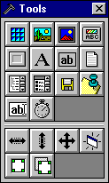 Figure 4-D Each icon on the Element Palette corresponds to a specific element used in the O·M·N·I Window Editor (with the exception of the "tool" icons in the bottom two rows). The "Element Descriptions" section below [Section 4.2.3] shows each icon with the proper element to which it is associated. Each element's special purpose is determined by its own unique set of properties . . . which allow you to "configure" an element by setting or adjusting their own specific values. This is performed on the stationary toolbar across the top of your screen in the Window Editor, where you may utilize various drop-down fields and lookup buttons to specify the properties and values you want [also see your Window Editor tutorial]. Some properties are common to other elements (i.e., contain the same value options and function essentially the same way in several different elements) and many are specific only to a particular type of element. Element-specific properties (and their values) are listed beneath the descriptions for each element to which they are associated in Section 4.2.3 below. Common properties, along with their value options, are described directly below. 4.2.1 Common Properties & Their Values Following is a complete listing of all the common properties found in the O·M·N·I Window Editor—with their accompanying descriptions and value options. They are grouped into three basic functional categories—including editing-management, basic design properties, and the "Commands" property (which is basic to various elements and functions). NOTE: If you wish to find out which elements contain which common properties, as listed below, refer to the properties list under each element description in Section 4.2.2 that follows—properties not preceded by an asterisk (*) in each element's listing are common properties. 4.2.1.1 Editing-Management Properties These are properties which aid in the "process" of editing and are not associated with any design or command functions in themselves.
4.2.1.2 Basic Design Properties The properties in this category are common to the most number of elements in the O·M·N·I Window Editor—simply because they are associated with the most fundamental design functions for creating windows and the elements within them.
Welcome {%SALUTATION%} {%LASTNAME%}!
Hint Text You may specify the hint text you wish to appear in the current window on your user's screen (in the form of a pop-up hint box) whenever their cursor is placed over the current element in that window.
4.2.1.3 Commands: Defining How Your System Will Act A command is an internal instruction that tells the Server to carry out a specific action when executed by the user at the terminal interface (such as when they click on an icon or button). You specify the action you wish to be carried out when a user selects the appropriate element. For instance, you might set the "Enter Chat Room" command for a button element on one of your windows to tell the Server to place the user into a chat room whenever the button is selected. In addition to setting a basic action, you can also associate sounds in both WAV and MIDI formats. You can also set security levels for specific commands so that the action will be carried out only when executed by someone who meets the proper security criteria. If the user does not meet the security settings you have specified, then "Alternate Commands" and "Alternate Sounds" may be used instead. O·M·N·I offers two basic ways of defining how your system's interface will act when your user interacts with it. The first way is by using the "Set Command" dialog box [Figure 4-E below]—which offers the most straightforward method of specifying commands for your system's interface and will satisfy most conventional system requirements. The second way is by using the O·M·N·I Basic script editor [Section 4.2.1.4 below]—which is a special software plug-in for the Window Editor which offers an advanced scripting language for more experienced system designers who want to make their windows interface more "interactive." The "Commands" property is the main property used for specifying actions on your user's interface and it is available in a number of elements, including the Bitmap Tile, Picture, Image View, Command Button, Panel, and Document View elements. To set any basic command for the currently selected element—select "Commands" from the properties drop-down field and click on the lookup button to bring up the "Set Command" dialog box. The "Set Command" dialog is separated by tab sections which provide a variety of options which you may use to define how the current window will behave and what action or event will be executed when the current element is selected by the user.
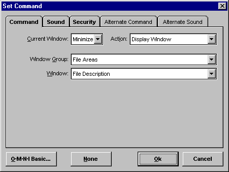 Figure 4-E Following are descriptions of each tab section and the available commands you may set in the "Set Command" dialog box. Command Current Window
Sound
Security Security Level & Locks
Alternate Command
Alternate Sound
4.2.1.4 O·M·N·I Basic: Advanced Scripting Language O·M·N·I Basic is a special scripting language that offers more experienced system designers a wider range of commands than the normal set of actions that are available in the "Set Command" dialog box. O·M·N·I Basic includes IF ... ELSE IF ... END IF logic capabilities, which allows you to specify an almost endless number of command-design variations for your interface. For example, with O·M·N·I Basic you can specify several actions to be performed at once when the user clicks a single button (or another element) on your system's interface. You can set the action to open several windows, close a few others, and minimize another window . . . all with one click. You can create a window with either buttons or a tree element on it which—when individual commands are executed—will load a different object into another element on the same window! You may also use O·M·N·I Basic to check and set user security levels. And you can use custom variables (which you define) to store specific application-related information. You can use O·M·N·I Basic for all your command settings if you want; because anywhere that the "Set Command" dialog box may be used for specifying commands, you can always use O·M·N·I Basic scripts instead. To utilize O·M·N·I Basic, a simple and easy-to-use script editor can be accessed by clicking on the O·M·N·I Basic button in the lower left corner of the "Set Command" dialog box. This will display the "Edit Script" window, which lists all the available O·M·N·I Basic commands inside the left pane. Here you may simply double-click any command you want to use for your script (you do not need to remember "command syntax" or "parameter lists" as you do with many programming languages!). If there are any properties to specify for the selected command, the "O·M·N·I Basic" dialog will instantly appear where you may easily set them. Your script entry will then automatically be listed in the right pane of the "Edit Script" window where your current script is always displayed. At any time, you can select a script line and use the button bar at the bottom of the window to edit command properties (also done by double-clicking a script item), move an item up or down in the script, or delete the selected script item. The O·M·N·I Basic script editor makes it easy for almost anyone to write basic scripts; yet it is powerful enough for advanced system operators and designers to create highly sophisticated system designs . . . even games and online applications! Following is the list of script commands presently supported by O·M·N·I Basic: CHAT Commands pertaining to chat and paging
DEBUG Commands that help debug a script
EXECUTION Commands that control script execution
EXTERNAL Interfaces to external applications
INTERFACE Commands that affect the user interface
LOGIC All decision-making commands
LOOPS Commands for creating process loops
SECURITY Security-related commands
SYSTEM Basic system commands
VARIABLES Declaring, using, and killing variables
[ALL COMMANDS] Lists all commands in O·M·N·I Basic These are the keywords that may presently be accessed in O·M·N·I Basic wherever a variable can be used: {%INPUTBOX!maxlength,"Prompt.","Default text."%} Opens a text input box on the screen and allows the user to enter as many characters as specified by "maxlength". {%OPTIONBOX!defaultresult,"Prompt.","Option1|Option2|etc.|"%} Displays a dialog box with a list of possible options with the one specified by "defaultresult" highlighted. Returns the option number that was selected. {%RANDOM!minvalue,maxvalue%} Generates a random value between the "minvalue" and "maxvalue" values. {%LTRIM!...%} Trims off all space characters on the left side of a string. For example {%LTRIM! Only testing.%} would result in the output of "Only testing." (without the quotes). You can also trim off the leftmost spaces from a variable by using {%LTRIM!{%VariableName%}%}. {%RTRIM!...%} Trims off all space characters on the right side of a string. See the %LTRIM!%} description for more information. {%TRIM!...%} Trims off any extra space characters at the both the left and right side of a string. See the {%LTRIM!%} description for more information. {%LCASE!...%} Converts all alpha characters in a string to lowercase. For example {%LCASE!This is a test.%} would result in the output of "this is a test." (without the quotes). You can also perform this function on a variable by using {%LCASE!{%VariableName%}%}. {%UCASE!...%} Converts all alpha characters in a string to lowercase. For example {%UCASE!This is a test.%} would result in the output of "THIS IS A TEST." (without the quotes). You can also perform this function on a variable by using {%UCASE!{%VariableName%}%}. {%TIME!%} This keyword in two different ways. The first is to use the simple version {%TIME!%} which always gets replaced with the current time in the format specified in the Windows Control Panel using the 12-hour format. The second is to used the advanced version which allows you to specify the formatting and even what parts of the current time are to be displayed. You do this by entering a formatting string after the exclamation point. For example: {%TIME!h:nn:ss AM/PM%} would display the time as 1:23:05 PM. The formatting string follows the same syntax as used by the FORMAT$ function in MS QuickBasic and Visual Basic. The following character combinations can be used in the format string: : Used to separate hours, minutes, and seconds. h Display the hour as a number without leading zeros (0-23). hh Display the hour as a number with leading zeros (00-23). n Display the minute as a number without leading zeros (0-59). nn Display the minute as a number with leading zeros (00-59). s Display the second as a number without leading zeros (0-59). ss Display the second as a number with leading zeros (00-59). Sample format strings and the resulting output: hh:mm AM/PM 08:50 PM h:mm:ss a/p 8:50:35 p h:mm 20:50 h:mm:ss 20:50:35 {%DATE!%} This keyword in two different ways. The first is to use the simple version {%DATE!%} which always gets replaced with the current date in the format specified in the Windows Control Panel. The second is to used the advanced version which allows you to specify the formatting and even what parts of the current date are to be displayed. You do this by entering a formatting string after the exclamation point. For example: %DATE!m/d/yy%} would display the date as 4/23/96. The formatting string follows the same syntax as used by the FORMAT$ function in MS QuickBasic and Visual Basic. The following character combinations can be used in the format string: / Used to separate months, days, and years. - Used to separate months, days, and years. d Display the day as a number without a leading zero (1-31). dd Display the day as a number with a leading zero (01-31). ddd Display the day as an abbreviation (Sun-Sat). dddd Display the day as a full name (Sunday-Saturday). ww Display the week of the year as a number (1-53). mmm Display the month as an abbreviation (Jan-Dec). mmmm Display the month as a full month name (January-December). q Display the quarter of the year as a number (1-4). y Display the day of the year as a number (1-366). yy Display the year as a two-digit number (00-99). yyyy Display the year as a four-digit number (100-9999). Sample format strings and the resulting output: m/d/yy 12/7/58 d-mmmm-yy 7-December-58 d-mmmm 7 December mmmm-yy December 58 {%SCREENWIDTH%} Returns the current screen width of the user's display. You can use this to create different sets of windows for different resolutions. {%SCREENHEIGHT%} Returns the current screen height of the user's display. {%SCREENCOLORS%} Returns the number of colors the user's display is capable of displaying. Common results you can expect from this keyword are 16, 256, and 65536. You can use this to create different windows for different color resolutions. {%CONNECTIONTYPE%} Returns the type of connection that the Term is using to connect to the server. This keyword returns the following: 1 - Dial-up connection 2 - Local login connection 3 - TCP/IP connection {%CONNECTTIME%} Returns the total number of minutes the user has been connected to the system. {%CONNECTHOURS%} Returns the number of hours the user has been connected to the system. {%CONNECTMINUTES%} Returns the number of minutes the user has been connected to the system. {%CONNECTSECONDS%} Returns the number of seconds the user has been connected to the system. Here is a chart showing the results if the users online timer on the Term's toolbar says "2:43:25":
{%PROP!...%} Can be used anywhere a variable can be used to read properties (i.e., Caption Text property) from elements on a window. For example, between this keyword and the Text Entry Field element, it is possible to create online forms and questionnaires. Here is an example of the definition you would use to get the Caption Text property contents from the element named TextEdit1: {%PROP!TextEdit1,Caption Text%}. Additional examples include . . . {%PROP!ElementName,Interval%} Will return the Interval property of the specified timer. {%PROP!ElementName,Top%} Will return the top position of the specified element on the window. {%PROP!ElementName,Left%} Will return the left position of the specified element on the window. {%PROP!ElementName,Width%} Will return the width of the specified element on the window. {%PROP!ElementName,Height%} Will return the height of the specified element on the window. {%PROP!ElementName,hWnd%} Allows you to read the Windows handle of the specified element. {%PROP!ElementName,ListCount%} {%PROP!ElementName,ListIndex%) {%PROP!ElementName,List,ListIndex%} {%WINDOWWIDTH%} Returns the width of the inside, usable client area of the current window (in pixels). {%WINDOWHEIGHT%} Returns the height of the inside, usable client area of the current window (in pixels). {%WINDOWLEFT%} Returns the left pixel location of the current window on the screen. {%WINDOWTOP%} Returns the top pixel location of the current window on the screen. {%LEFT!length,string%} Returns the leftmost characters specified by the length field from the string (in the string field). For example: {%LEFT!5,Sample Text%} would return "Sample" (without the quotes) as the result. You can also pass variables to both the length field and the string field. {%RIGHT!length,string%} Returns the rightmost characters specified by the length field from the string (in the string field). For example: {%RIGHT!5,Sample Text%} would return " Text" (without the quotes) as the result. You can also pass variables to both the length field and the string field. {%MID!start,length,string%} Returns a string of characters from within the specified string. Use the start field to specify the starting character location . . . and length as the number of characters to return. For example: {%MID!4,5,Sample Text%} would return "ple T" (without the quotes) as the result. You can also pass variables to the start, length, and string fields. {%LEN!string%} Returns a numeric value indicating the number of characters in the passed string. For example, if {%Temp%} contains "Sample Text" . . . the keyword {%LEN!{%Temp%}%} would return 11. {%CURRENCY!string%} Returns the passed variable as a string formatted to display currency. For example, if {%Temp%} contains "1143.9" . . . the keyword {%CURRENCY!{%Temp%}%} would return "1,143.90" (and suggests how useful this function may be for building online order forms). {%ADD! Returns the numeric result of mathematically adding the first parameter to the second. For example, {%ADD!1,5%} would return 6. Variable references can be used as the parameters passed to the function. {%SUBTRACT! Returns the numeric result of mathematically subtracting the second parameter from the first. For example, {%SUBTRACT!3,1%} would return 2. Variable references can be used as the parameters passed to the function. {%DIVIDE! Returns the numeric result of mathematically dividing the first parameter by the second. For example, {%DIVIDE!10,2%} would return 5. Variable references can be used as the parameters passed to the function. {%MULTIPLY! Returns the numeric result of mathematically multiplying the first parameter by the second. For example, {%MULTIPLY!10,2%} would return 20. Variable references can be used as the parameters passed to the function. {%ASC! Returns the ASCII character code of the leftmost character in the string passed to it. For example, {%ASC! %} would return a value of 32 (representing the space character). {%CHR! Returns the character represented by the passed value. For example, {%CHR!32%} would return the space character. The parameter can be replaced by a variable reference. {%TOBITS! Returns the binary equivalent of the string passed to it. What is returned is a string of the characters "0" and "1" representing the binary version of the bytes in the string given to it. {%MouseX%} Returns the value of the X (or horizontal) pixel location that the mouse was clicked on for an Image, Picture, Panel, or Bitmap Tile element. {%MouseY%} Returns the value of the Y (or vertical) pixel location that the mouse was clicked on for an Image, Picture, Panel, or Bitmap Tile element. You can also reference all existing {%keywords%}within O·M·N·I Basic anywhere a variable can be used. And all places where you can use variable references also allows the use of indirect variable references. For example, if you wanted to have a series of variables named {%Temp1%}, {%Temp2%}, {%Temp3%}, and {%Temp4%} and not have to reference each one individually by name . . . you could place references to them inside a DO..LOOP and reference them like this: {%Temp{%Indirect%}%}. In this example you would declare a variable called {%Indirect%} and increment its value from 1 to 2 to 3 and finally 4. Within the loop, the reference to {%Temp{%Indirect%}%} would be replaced with an actual reference to {%Temp1%} if the variable {%Indirect%} value was "1" . . . or to {%Temp2%} if {%Indirect%} value was "2" . . . etc. 4.2.2 Element Descriptions & Their Specific Properties Each element in the O·M·N·I Window Editor is listed along with its toolbar icon from the Element Palette [see Figure 4-D above] and described in full detail below. Also—under each element's description is a listing of all the properties associated with that element. Those preceded by an asterisk (*) are specific only to that element and no other (although, in one or two instances, some variation of the property may be found in another element). Those not preceded by an asterisk are common properties [as described in Section 4.2.2 above]. Complete descriptions of all the properties specific to an element (i.e., all the properties preceded by an asterisk) . . . follow each element's property listing. 4.2.2.1 Window Element Default Name: Window NOTE: Since there is never more than one Window element specified for any window you create, the "Name" property is not necessary for the Window element. The element name is always "Window"—by default. Description: The fundamental element constituting a window; inside which (more accurately, upon which) all other elements are placed. Remarks: You do not use the Element Palette to create a new window. To create any new window using the O·M·N·I Window Editor, you must first create (or select) a window group in the Window Browser, then press Add and enter a descriptive Name for the new window in the "Add Window" dialog box. When you select Ok the new name will instantly appear in the window listing beneath the currently selected window group in the Window Browser. To bring the new window element up on your screen where you can start working on it, highlight the new window name and press Edit. A "blank" window will appear in the middle of your screen where you may begin to specify properties and values, or add other elements of your choosing from the Element Palette. Properties: * Autosize Elements * Control Box * Startup Position Window Element-Specific Properties
4.2.2.2 Bitmap Tile Element
 Default Name: Tile1 Description: A special design tool which allows you to repetitively tile a bitmap image or icon. Remarks: The graphical effect achieved by this element is somewhat similar to that of the Tile option for Wallpaper in the Windows 3.x "Desktop" applet. It is especially useful for creating background patterns—for example, with logos, icons, or other simple rectangular images—without having to create a separate picture element for each repeated occurrence of the image in a pattern. Properties: Background Color * Crop Y Name Bitmap Tile Element-Specific Properties
4.2.2.3 Picture Box Element
 Default Name: Picture1 Description: The primary tool for adding a bitmap (BMP), icon (ICO), or metafile (WMF) object to a window where stretching or resizing of its contents is not required. [Also see "Image View Element" below.] Remarks: The Picture Box element is the only element which allows you to display metafile images. Properties: Background Color Commands Name Picture Box Element-Specific Properties
4.2.2.4 Image View Element
 Default Name: ImageView1 Description: The Image View element is the primary tool for adding BMP, JPEG, GIF, and CMP image objects to a window where stretching and resizing of its contents may also be required. Remarks: In O·M·N·I you have a wide range of options for controlling graphic image quality and transfer speeds. With the Image View element you have the option of displaying resizeable BMP, JPEG, GIF, or CMP images (in 4, 8, 16, or 24-bit color) . . . anywhere on your system's windows. Unlike the Picture Box element, the Image View element automatically stretches the specified image (proportionally) whenever the element is resized. Properties: Background Color Commands * Picture Image View Element-Specific Properties
4.2.2.5 Command Button Element
 Default Name: Button1 Description: Used to add familiar (Windows-like) graphical command buttons to your system's windows and associate them with specific command actions—such as opening or closing a window, or simply exiting the system. Remarks: The O·M·N·I Command Button element breaks away from simple icon-based "command" systems and offers greater flexibility for presenting a more familiar Windows-like GUI. Button size and appearance may be completely modified to suit individual tastes and preferences. Properties: * Bevel Width Font: Strikethru Rounded Corners Command Button Element-Specific Properties
4.2.2.6 Panel Element
 Default Name: Panel1 Description: Beyond the Window element, this is the basic building block for creating graphical window designs in the O·M·N·I Window Editor. While the Window element constitutes the total design area of your window on which all other elements are placed, the Panel element allows you to create individual design sections on which other elements (including other panels!) may also be arranged or ordered. Remarks: The Panel element is perhaps the most versatile element in the Window Editor. You may use it to define specific areas of your window on which other elements or objects may be placed—or you may use it for "blended background" message displays (first specifying the appropriate "Caption Text" then matching the panel's "Background Color" to that of the element behind it, with no bevels or borders, so that it appears as "one" graphical element). You may also use the Panel element to create stylized "borders" around other graphical elements in a window by making the panel just slightly larger (proportionally) than the other element, then selecting Send to Back or Send Back One Level under Edit on the main menu bar so that it appears "behind" it with all four edges showing. Precise sizing and fitting adjustments may be made by simply toggling between the selected "foreground" element and panel element, alternately! Properties: Background Color Click Top Hint Text Panel Element-Specific Properties
4.2.2.7 Label Element
 Default Name: Label1 Description: The Label element's primary function is to allow you to superimpose caption text—i.e., using a transparent background—over a bitmap in a Window element (so that only the caption text appears on the bitmap). This is done by simply specifying the "Transparent" option for the Background Style property. Remarks:
The Label element allows you to superimpose
"transparently" over a Window element . . . but IMPORTANT: The Label element will not appear in front of other elements! . . . only the Window element. Therefore, you may superimpose over a bitmap image in a window only if it is specified by the Window element's Picture property—not any other element. Also, the Send to Back and Bring to Front options under Edit on the menu bar [Section 4.3.2 below] have no effect on Label elements. Properties: Background Color Font: Name Name Label Element-Specific Properties
4.2.2.8 Plain Text View Element
 Default Name: TextView1 Description: This element allows you to display any plain text object previously created in the Object Browser. Remarks: To create a plain text object, you must first create (or select) an object group in the Object Browser, then press Add to enter a descriptive Name for the object in the "Add Object" dialog box. You must also select "Plain Text" from the Type field listing so that the new name is associated with a plain text object. When you select Ok the new name will instantly appear in the object listing beneath the currently selected object group in the Object Browser. To create the actual text object, highlight the new object name and press Edit. The "Edit Plain Text Object" dialog will appear where you may proceed to enter your text as you want it to appear inside the TextView element of your window. Properties: * Allow Edit Font: Size Name Plain Text View Element-Specific Properties
4.2.2.9 Document View Element
 Default Name: DocView1 Description: This element allows you to display any document object previously created in the Object Browser. You can also use it to create invisible "hot spots" on a window for executing commands [described below]. Remarks: To create a document object, you must first create (or select) an object group in the Object Browser, then press Add to enter a descriptive Name for the object in the "Add Object" dialog box. You must also select "Document" from the Type field listing so that the new name is associated with a document object. When you select Ok the new name will instantly appear in the object listing beneath the currently selected object group in the Object Browser. To create the actual document object, highlight the new object name and press Edit. The "Edit Document Object" window will appear where you may proceed to create your document as you want it to appear inside the DocView element of your window [see "Document" under Section 4.1.1.2 above]. Creating Invisible "Hot Spots": You can use the "Commands" and "Background Style" properties of the Document View element to create special invisible "hot spots" on your window which—when the element is clicked—will carry out the command that you specify. For example, you can use a part of a picture or graphic in your window, instead of a button, to carry out any standard command . . . simply by placing a hot spot over it! To create an invisible hot spot, size and position the Document View element where you want the hot spot to be on your window (it must be above all other elements on the window). Set the "Commands" property to whatever event you want to happen when the hot spot is clicked. Now set the "Background Style" property of the Document View element to "Transparent." You now have an invisible hot spot on your window which—when clicked by a user—will carry out the specified command! NOTE: Since the hot spot is completely "invisible," you may also find this feature useful for special access and security applications. For instance, you could let only those users who are allowed access to a certain area actually know where the hot spot is on a window. For added security, you may also specify Security Level & Locks for the hot spot when setting commands for it! Properties: Background Color Height * Scrollbar Vertical Document View Element-Specific Properties
4.2.2.10 Tree View Element
 Default Name: TreeView1 Description: The basic element used to display any tree structure object previously created in the Object Browser. [Also see "Column Listbox Element" below for an alternative application used specifically for message board and file area listboxes.] Remarks: For a complete discussion on how to create and display tree structure objects—see "Tree Structure" under Section 4.1.2.2 [above] and "Setting Up File Areas" under Advanced Editing Procedures in your Window Editor tutorial. Properties: Background Color Font: Size Name Tree View Element-Specific Properties
4.2.2.11 Column Listbox Element
 Default Name: ColumnListbox1 Description: A special design tool which should be used in place of the Tree View element [described above] for the listing windows, or "listboxes," in your file and message board areas. Remarks: While you may still use the Tree View element for file area and message board listboxes (i.e., to display a tree structure object previously created in the Object Browser) . . . the Column Listbox element should be used instead—to ensure that all the columns in your listings line up correctly! This element functions basically the same way as the Tree View element, except that you specify the listbox "Starting Text"—instead of utilizing the "Contents" property—to specify the appropriate tree structure object. For a complete discussion on how to create and display tree structure objects—see "Tree Structure" under Section 4.1.2.2 [above] and "Setting Up File Areas" under Advanced Editing Procedures in your Window Editor tutorial. Properties: Background Color Font: Strikethru * Starting Text Column Listbox Element-Specific Properties
4.2.2.12 File Area Control Element
 Default Name: FileArea Description:
Acts as an interface between any windows you create
for displaying file area information . . . and
the database in O·M·N·I where your file area
information is actually stored—allowing you to
duplicate your file area listing in any number (and
variety) of windows that you want . . . without
the need to duplicate database information for every
window. Remarks: For a complete discussion on how to use the File Area Control element—see "Setting Up File Areas" under Advanced Editing Procedures in your Window Editor tutorial. Properties: * Element Description * Element FA More Left File Area Control Element-Specific Properties
4.2.2.13 Message Board Control Element
 Default Name: Message Board Description:
Similar to the File Area Control element, the Message
Board Control element acts as an interface between any
windows you create for displaying message
board postings . . . and the database in O·M·N·I where
your message board information is actually stored. Remarks: For a description of this element, simply start with "Setting Up Message Board Areas" above, then refer to the previous discussion of the File Area Control element under "Setting Up File Areas." Properties: * Element MB Compose * Element MB Next Name * Element MB Date * Element MB Previous * Set MB Commands * Element MB From * Element MB Subject * Titlebar MB Name * Element MB List * Element MB View Top * Element MB Message Left * View Message Comm Message Board Control Element-Specific Properties
4.2.2.14 Text Entry Field Element
 Default Name: TextEntry1 Description: This element allows you to add a field to a window which will accept text entries from a user. It can be used with O·M·N·I Basic, for example, to create online forms and questionnaires. Remarks: The Text Entry Field element is used in conjunction with the O·M·N·I Basic command {%PROP!...%} for creating online forms. [You can find a description for this command under Section 4.2.1.4—"O·M·N·I Basic: Advanced Programming and Scripting Language"—above.] It is recommended that you become familiar with O·M·N·I Basic before attempting to use this element. You must also have the O·M·N·I Basic script editor—a separate software plug-in—installed. Properties: Background Color Font: Strikethru Tab Order Text Entry Field Element-Specific Properties
4.2.2.15 Timer Element
 Default Name: Timer1 Description: This simple (but extremely powerful!) element allows you to execute O·M·N·I commands at regular, precisely timed intervals. Remarks: You may use this element to set time intervals for the execution of any command you wish to specify in the "Set Command" dialog box. The Timer element is only visible in the Window Editor and cannot be seen by users that connect to your system. Properties: * Command Timer * Interval Name Timer Element-Specific Properties
4.2.3 Other Tools Also visible on the Element Palette is a series of special tool icons which may be used for various editing functions, as described below: 4.2.3.1 Center Element Horizontally
 You may center any currently selected element horizontally inside a window by pressing this icon on the Element Palette. Elements may only be centered relative to the window itself. 4.2.3.2 Center Element Vertically
 You may center any currently selected element vertically inside a window by pressing this icon on the Element Palette. Elements may only be centered relative to the window itself. 4.2.3.3 Set Precise Size & Position
 By selecting this button you may access the "Placement" window [Figure 4-F below] which aids in precisely sizing and positioning the currently selected element on a window.
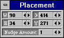 Figure 4-F You may adjust an element's specific width and height as well as its x and y position by using the nudge (arrow) buttons in the W, H, X, and Y fields, respectively. You may adjust the number of pixels each "nudge" will move the selected element by increasing or decreasing the amount in the Nudge Amount field. 4.2.3.4 Refresh Display of Window
 Allows you to refresh a window after you have made changes—this simply re-displays the window with all the new changes. 4.2.3.5 Create Inset Panel
 A convenient design tool which lets you instantly create an inset panel "behind" any selected panel to make it appear as its "own" inset border. The inset panel is automatically sized "around" the currently selected element. 4.2.3.6 Duplicate Element
 Allows you to duplicate a selected element in a window if you wish, for instance, to repeat a special style or design without having to re-create it. 4.3 The Menu Bar You may use the menu bar to control many of the Window Editor's functions and options which cannot be accessed from the Element Palette or tool bar. These menu bar options are listed below: 4.3.1 File The File menu allows you to save and close windows, as well as to import and export windows and objects. Following are brief descriptions of each File menu item:
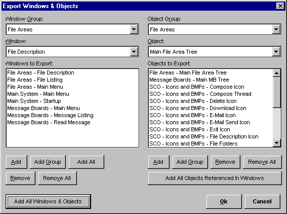 Figure 4-G 4.3.2 Edit The Edit menu offers some additional tools to aid in editing windows in the Window Editor. It is only functional when a window is open on the screen for editing.
WARNING: You will not be
prompted . . . so be absolutely sure
you want to delete the currently selected element
(defined by sizing handles) before
4.3.3 System The System menu is where you go to specify the "Startup" window and "Permanent" windows on your system.
IMPORTANT: Whenever you specify or make any changes to the Permanent and/or Startup windows on your system, you must use the "copy" function in the O·M·N·I Server (under Server on the main menu) before the specifications will take affect. [See Section 3.1.3 in your O·M·N·I Server documentation for complete instructions.] 4.3.4 View The View menu lets you select which editing tools you would like to have open while working within the Window Editor. The tools you may choose to have open are Tools (the Element Palette), Object Browser, Window Browser, Elements, and Properties. Simply check the appropriate menu item to display it, or uncheck it to remove it from view. 4.3.5 Help Selecting Help + About... displays the O·M·N·I Window Editor's "About" window.
* |